Similarity matrix is a comparison between two different sets of data points and is shown in a matrix.When the colors are more different that means that the two points have a greater difference. link
Stem and Leaf Plots are used to help numerically organize data. The Stem is typically the place holder while the leaf represents the second number as well as the frequency of the stem. Stem and Leaf plots are useful for seeing a graphical representation of a series of data. link
linkBox Plots are used to group data into five quadreds. They use a measure to show the 25% to the 75% percentile. Box Plots are excellent at finding averages and medians of data sets. This is a generic example of a boxplot.
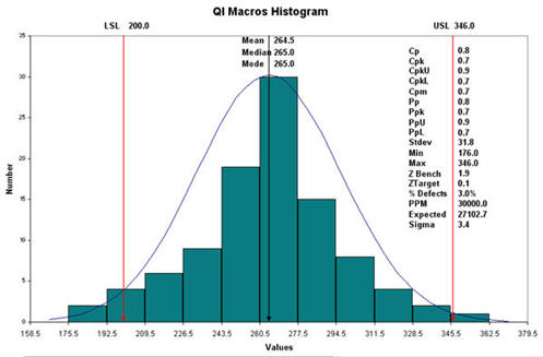
A histogram is a visual representation of the distribution of data. The more times that a variable comes up the higher that the bar for that variable will be. As this Histogram shows, this is extremely useful in business and in this example used to predict sales.link
Parallel coordinate graphs are used to show numerous amounts sets of data. This graph shows the genes to cell ratios. Each line is a different variable. Every line has a connection all the way through the graph. link


