
Tuesday, April 19, 2011
Correlation matrix
Similarity Matrix

Stem and Leaf Plot


Parallel Coorinate graph

Triangular Plot


Climograph

Population Profile

Scatterplot Map

Friday, April 15, 2011
Index value plot

Friday, April 8, 2011
Bilateral graph

Nominal area choropleth map

Unstandardized choropleth map

Standardized choropleth map

Thursday, April 7, 2011
Univariate choropleth maps

Bivariate choropleth maps

Unclassed choropleth maps

Wednesday, April 6, 2011
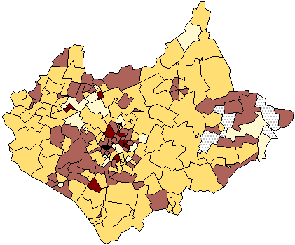
Classed Chloropleth Map
Range graded proportional circle map

Continuously variable proportional circle map


DLG Map


Isopleth Map

Isopach Map

Isohyet Map

Isotachs Map

Isobar Map

Tuesday, March 1, 2011

Doppler Radar Map

Black and White Aerial Photo Map

Infrared Aerial Photo
Infrared aerial photo maps use infrared technology to distinguish between different things like ecosystems and rivers. The infrared distinguishes thing by picking up the different temperatures of different things.

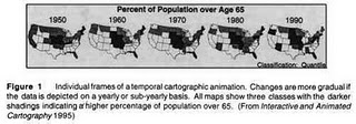
Cartographic Animation
Thursday, February 24, 2011
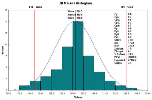
Statistical Map

Cartograms


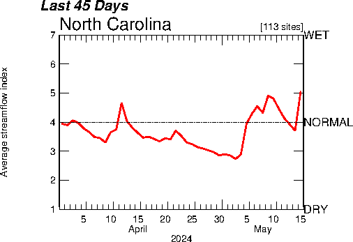
Isoline Map

An Isoline map depicts something that is actually 3 dimensional in a 2 dimensional map. This is an example of a map that displays the temperatures in North Carolina.
Proportional Circle Map

Proportional circle maps depict numerical information proportional to the circle size. For instance this map shows the Mexican population in the Western USA with the larger circles meaning a greater population.
Chloropleth Map

Dot Distribution Map

This map is a dot distribution that represents people with AIDS as of September 1997. Each dot is a representative of 30 cases. This type of map is used to show the frequency of a certain thing in a certain area.
Propoganda Map

Hypsometric Map


Thursday, January 20, 2011
Cadastral Map

This is a Cadastral map of the Iranian land use in Namkabrood. It is a cadastral map because it shows of the land is sectioned of for certain uses or owners.
Thematic Map

This is a thematic map that represents the median age in the North-East United States. It is a thematic map because it focuses on a certain social aspect in a specific geographic area.
Topographic Map

This is a Topographic map of the Grand Canyon. A Topographic map shows the elevations of places. The lines on the map are called contour lines and are at the same elevation throughout the map. This particular map is used for determining hiking paths. Hikers look at it to find out how much of an elevation change there is going to be on a trail.
Tuesday, January 18, 2011
Planimetric map

This is a planimetric map of France. This means that this map is a horizontal representation of the country France. It does not take in to consideration elevation. It uses colors to differentiate different provinces in France.
Mental Map

This is a mental map of Nottingham City Center in 1997. It conveys how the person that drew it sees the roads and stores in the area. The map is not completely accurate because it is a mental map meaning it is a representation of how this person stores the information of Nottingham City Center in their mind.
Subscribe to:
Comments (Atom)